3. Improving the similarity search map plot
The map figure that emerged as the result of A basic similarity search workflow is not particularly beautiful. We can and should apply some changes to this plot to make it more readable and visually pleasing. The following code is also included in the similarity_search.R script.
Increase the spatial resolution of the prediction grid.
locate()takes more time to compute with this change, but for individual samples and time slices it is generally very much affordable to switch to higher resolutions. Here we go from the 50km grid above to a much finer 20km grid. The number of spatial prediction points increases from 4738 to 29583.
spatial_pred_grid <- mobest::create_prediction_grid(
  research_land_outline_3035,
  spatial_cell_size = 20000
)
Change the colour scale. We choose the highly readable and colourblind-safe viridis palette.
ggplot() +
  geom_raster(
    data = search_product,
    mapping = aes(x = field_x, y = field_y, fill = probability)
  ) +
  coord_fixed() +
  scale_fill_viridis_c()
Add helpful elements to the plot. We add the border of the research area, a marker for the spatial position of the search sample, a plot title and an annotation to indicate the search time.
research_area_3035 <- research_area_4326 %>% sf::st_transform(3035)

ggplot() +
  geom_raster(
    data = search_product,
    mapping = aes(x = field_x, y = field_y, fill = probability)
  ) +
  scale_fill_viridis_c() +
  geom_sf(
    data = research_area_3035,
    fill = NA, colour = "red",
    linetype = "solid", linewidth = 1
  ) +
  geom_point(
    data = search_samples,
    mapping = aes(x, y),
    colour = "red"
  ) +
  ggtitle(
    label = "<Stuttgart> ~5250BC",
    subtitle = "Early Neolithic (Linear Pottery Culture)\nLazaridis et al. 2014"
  ) +
  annotate(
    "text",
    label = "6800BC",
    x = Inf, y = Inf, hjust = 1.1, vjust = 1.5
  )
Adjust plot layout details. We switch to the plot theme
theme_bw, turn off axis labels and adjust the legend title.
... +
  theme_bw() +
  theme(
    axis.title = element_blank()
  ) +
  guides(
    fill = guide_colourbar(title = "Similarity\nsearch\nprobability")
  )
This leaves us with the following, more refined plot:
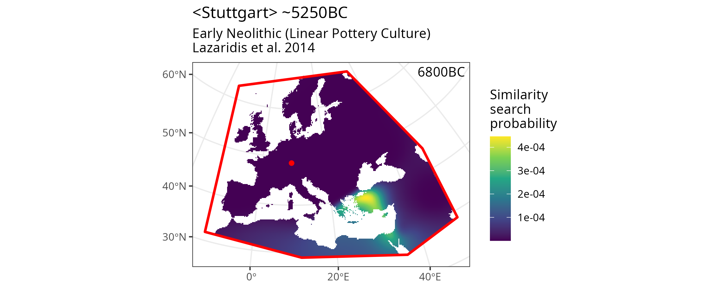
A more beautiful and informative version of the result plot.